Using Color Theory to Make a Photo Pop
Color theory isn't just for painting. It might sound a bit like a boring memory from elementary school art class, but color theory is a surprisingly fun and simple way to amp up your photography compositions.
Whether you're shooting at home, in the studio, or anywhere else, there are a few basic concepts from color theory you can use to tell stories and add interest to your photos.

Where color theory all begins: the rainbow.
Photo by Valeria Boltneva · View Photo
What is color theory, anyway?
Color theory is a useful way of understanding and thinking about the relationships between colors and how people see them. A solid understanding of the ideas behind color theory can help you use color to maximum impact in your creative work. Color theory is used by visual artists of all kinds, from painters to videographers to many photographers.
First things first: the primary colors. The most typical primary colors, the ones you're probably thinking of, are red, yellow, and blue.
Today we're going to focus on the RYB color model as it's the one most commonly used in fine art, but there are other color models out there. Some people prefer to use red, green, and blue as their primary colors, and there the CMYK color model is popular for use in color printing.
The primary colors make us the basis of the color wheel, which then expands out into the secondary and tertiary colors. The color wheel is the basis of all the color theory photography ideas we're going to explore here.
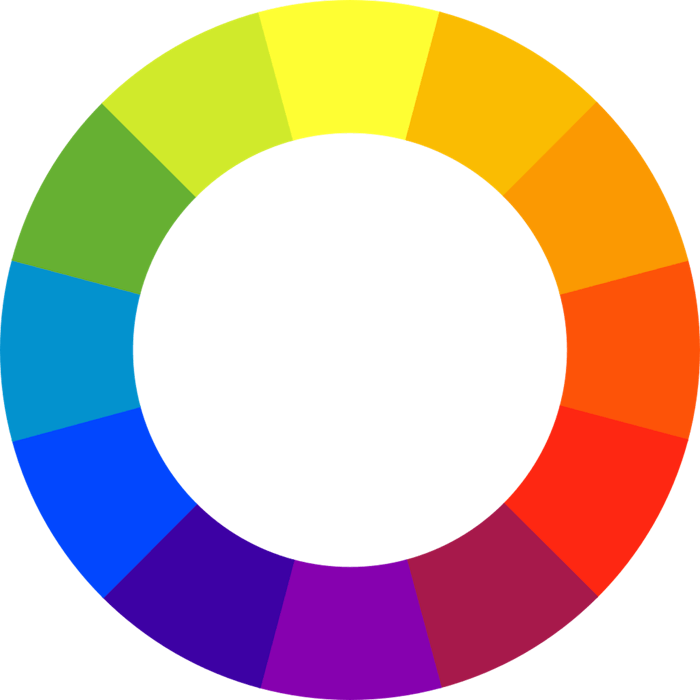
The red-yellow-blue color wheel, courtesy of Wikipedia.
Understanding the color wheel
If you've ever painted with acrylics, you've seen the color wheel in action when you mix paints together. Combining the primary colors results in the secondary colors: orange, green, and purple.
Then come the tertiary colors, which are neatly visualized on the color wheel for us. These are made by mixing the secondary colors together, and they include magenta (red and purple), teal (blue and green), and chartreuse (yellow and green).
The color wheel also showcases complementary colors. These are the colors opposite each other on the wheel: for example, yellow and blue.
When mixed together, complementary colors literally cancel each other out—the result is a muddy grey or black shade. But when juxtaposed next to each other, for example in an artfully composed photo, the result is a vivid pop.
To recap, we've got the following color relationships to work with:
- Primary colors
- Secondary colors
- Tertiary colors
- Complementary colors
There's just one more to add: analogous colors. These are the colors that sit next to each other on the wheel and share one color in common. For example, red, orange, and red-orange are analogous colors.
Analogous colors can also create great effects in your photography, although they will tend to feel a bit less dramatic than complementary color schemes, for example. Analogous colors are often found in nature—think of a purple and blue sunset, or red and orange fall leaves.
Now we've covered the essentials of color theory, here's how you can make use of it for incredible photos.
Color Theory Idea #1: Complementary Colors
As we talked about above, combining complementary color in a photo is essentially a foolproof way to create a memorable visual effect.
You don't necessarily need very bright colors, or a lot of color, to pull off a complementary color scheme in your shot. The key is the contrast between the two colors.
It's easy to create interest by styling a portrait with complementary colors. But you don't always need to set up these kind of shots. Once you start keeping an eye out for complementary colors, you'll find they occur all over the place, whether you're doing street photography or shooting in nature.

Pink and green always makes for an eye-pleasing combo.
Photo by Jeffrey Czum · View Photo

Going big and bold with red and green.
Photo by Marián Šicko · View Photo
Color Theory Idea #2: Monochrome
Go all-in on your favorite color for a compelling effect. You might be surprised at how many different colors tend to be in a shot once you try to stick to just one.
Careful editing will definitely be your friend for these photos. The monochrome color effect can be wonderfully minimal or surprisingly complex depending on how many textures and tones of color you incorporate.

Ocean photos allow you to capture all the many shades of blue.
Photo by Matheus Natan · View Photo

100% pale pink.
Photo by medium photoclub · View Photo
Color Theory Idea #3: Split-Complementary
For this color scheme, choose a color and its complementary color, and then add the two colors next to the complementary color on the color wheel. Sound confusing? Just check out the examples below.
The split-complementary color scheme still packs a punch, but in a more restrained way than the standard complementary color contrast.

The dominant blue and orange in this photo create a complementary effect, but the red-orange created by the shadows really steps things up.
Photo by Danial Zainudin · View Photo

There are many colors in this photo, but the deep green offset by pops of orange creates a great effect.
Photo by Ben Maxwell · View Photo
Color Theory Idea #4: Analogous Colors
Focus on three colors located next to each other on the color wheel for images that can feel wonderfully weird or nicely harmonic, depending on which colors you choose.
Analogous colors such as red, red-orange, and orange will likely look nicely paired, whereas orange, yellow, and green may feel unexpected. Experiment with these color groupings in your photos and see what kind of unexpected results occur.

The warm toned colors here are just right for a portrait with feeling.
Photo by José Luis Photographer · View Photo

Dark green, lighter green, and blue combine for a thoughtful mood.
Photo by Анна Васильева · View Photo

Noir movie vibes in this analogous color shot.
Photo by Aleksandar Pasaric · View Photo
Color Theory Idea #5: Tetradic Color
Okay, even the name of this color scheme is a bit intimidating, and it can indeed be a hard one to pull off.
But the concept behind the tetradic color scheme is actually simple. This color scheme is just a combination of two sets of complementary colors—tetradic refers to the four colors used. It's only tricky due to the challenge of finding those colors in a harmonious shot... or styling them yourself in a way that works. Here's some inspiration.

Purple, yellow, blue, and orange come together for a dramatic sunset shot.
Photo by Steshka Willems · View Photo

Flowers are a great subject for tetradic color play. Here, pink meets dark green, and orange and blue add contrast.
Photo by 高子良 · View Photo

Red and green meets orange and blue for a beautifully colorful, crisp photo.
Photo by Elīna Arāja · View Photo
Cover photo by Vlad Shu.
Written by Jill Evans · May 23
Editor of Pexels Stories and 35mm photographer